"6 Digits Paints" Logo
The assignment was to come up with a logo for a fictitious company.
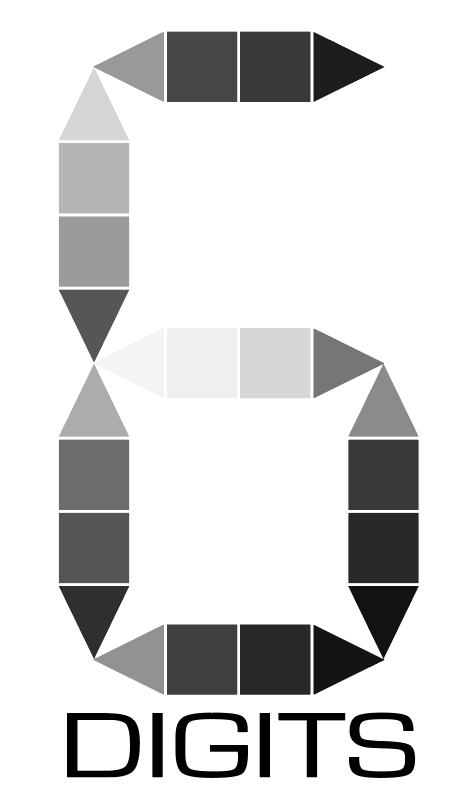
Each logo is also required to have a Black n' White or Grayscale version.
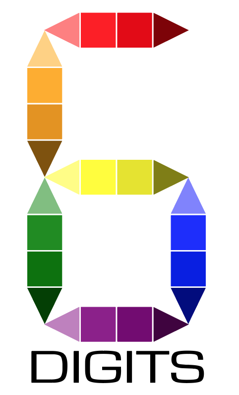
My fictitious company is called 6 Digits Paints (shortened to 6 Digits for the logo).
6 Digits is an online paint company where customers can enter a hex code (e.g. #002FA7, #9C1938, #FF00CC, etc.) and get the paint that is exactly that color, similar to how people get different colors on the computer (other paint companies will have default colors that may be close to a particular hex code you want, but not exactly). This way, customers can choose from over 16.5 millions colors so they can get the exact color they want for whatever kind of paint they need.
The reason I call it 6 Digits is because color hex codes (minus the hashtag/pound sign) are typically 6 digits.
The logo I designed is made to look like a color swatch and like a digital clock number, tying both colors and "digits" together. The swatches are in a shade/tint gradient to essentially show that the customer can get any color they want.
Each logo is also required to have a Black n' White or Grayscale version.
My fictitious company is called 6 Digits Paints (shortened to 6 Digits for the logo).
6 Digits is an online paint company where customers can enter a hex code (e.g. #002FA7, #9C1938, #FF00CC, etc.) and get the paint that is exactly that color, similar to how people get different colors on the computer (other paint companies will have default colors that may be close to a particular hex code you want, but not exactly). This way, customers can choose from over 16.5 millions colors so they can get the exact color they want for whatever kind of paint they need.
The reason I call it 6 Digits is because color hex codes (minus the hashtag/pound sign) are typically 6 digits.
The logo I designed is made to look like a color swatch and like a digital clock number, tying both colors and "digits" together. The swatches are in a shade/tint gradient to essentially show that the customer can get any color they want.
|
|
Sketches & Comps
I started out with the brainstorming web and came up with a lot of things that could work for a name and then a logo. The word "digits" and "hex code" stood out to me. I first thought that I could do something with magic and spells (otherwise known as "hexes"), but the "digit" stood out more.
So, at first, I started with just a plain number 6 with a gradient on it. Looked too generic for my taste. Then I came up with this idea.
I didn't really make a sketch first. I was already messing around on Illustrator (to get the hang of what I was doing) when the idea came to me, so I just tried it out to see if I could do it (better than drawing it first and then finding out that I couldn't make it on Illustrator), and it turned out pretty well if I do say so myself.
My first "draft" had just various shades of colors with not much rhyme or reason, then someone in my class (on review day) that I should make the colors look like a gradient. So I tried a light-to-dark gradient and then a one-color-to-the-next gradient. I ended up liking the light-to-dark gradient better, so I stuck with that.
I also first started with a font/type that looked like a receipt, but someone in my class didn't like it, so I tried many fonts until I found the one you're looking at.
